A simple solution for users with multiple accounts
March 5, 2026
Websites and mobile apps sometimes provide methods for switching between multiple accounts or usernames. However, the account switching functionality is often not in the normal flow of the login process. The account switch is nested within a user menu after logging or presented differently from a standard login form.
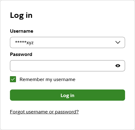
Fidelity recently updated their website to handle multiple accounts in a simple way. When clicking “remember my username” and after logging into the system successfully, the username gets added to a drop down list for later use.
Web browsers and password managers can mimic this behavior by turning standard text boxes into a drop down lists containing a list of login credentials. Not everyone uses their browsers built-in password manager or an external password manager, though.
Fidelity’s solution is built-in and keeps the user’s experience consistent with a common login form.
An alernative to typing your email address twice
January 29, 2026
I get annoyed when I have to enter my email address twice during the registration process on a website or in a mobile app. I understand this is done to ensure my email address is correct. If I enter my email address incorrectly, I may never receive an email message to confirm or complete my registration. I may also never be able to reset or recover my password if the password reset or recovery process sends a message to an invalid email address.
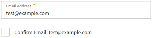
I recently noticed a different solution to entering my email address twice on the Regions Bank website. Regions Bank only makes me enter my email address once while signing up for online banking. The email address is automatically copied next to a checkbox where I have to confirm that my email address is entered correctly.
There is still some additional effort having to click a checkbox. However, the effort is lower than typing my email address two times in a row. I’d rather click or tap a checkbox once instead of typing at least 3 (or 6) characters.
While the checkbox is not visually marked as a required field in the example at Regions Bank, the Confirm Email checkbox is mandatory. The form displays an error message and cannot be submitted unless the box is checked.
This design pattern could be extended to other fields such as phone numbers where people are asked to enter the same data twice.